
I choose “Dream Box” for the company name.

Logo

Name card

Envelope

Letterhead
The logo is using the lower case “d” and “b” to create the logo symbol. This is because “d” represents the first font of “dream” and “b” represents the first typo of “box”. I used three colors for my company logo, which were black and red. I used these colors to make the company logo look more elegant and each of the color has different meaning to represent the message of the company. I use the red color in the logo symbol “d” to represent dreams like power, energy to determination as well as passion on music. I used black color in the symbol “b” to represent the box which was the van is an elegant studio. After creating my logo, I continued to do company stationery which is company name card, letterhead and envelope.
Imagery Suggestion
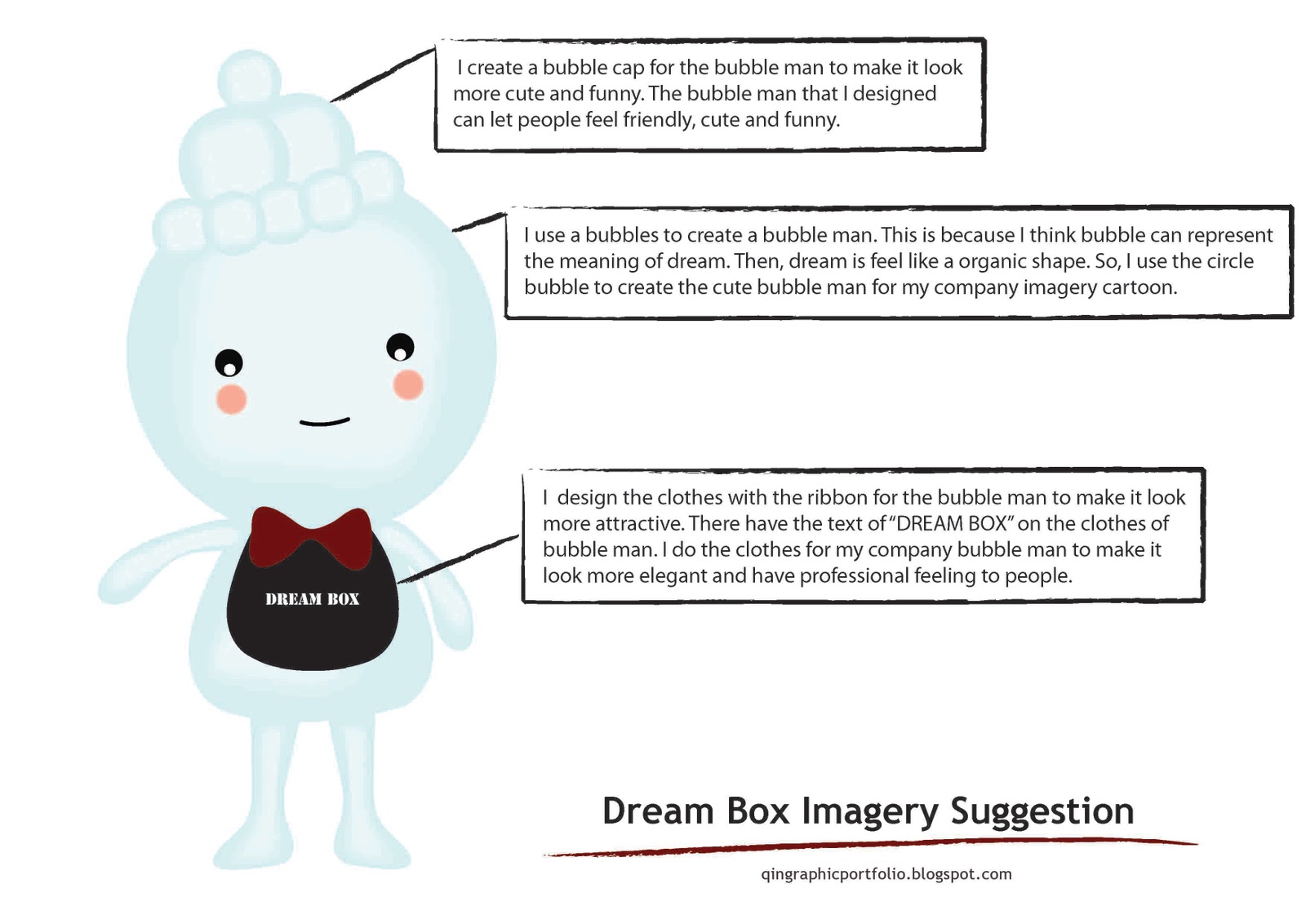
I designed the company imagery suggestion. I used a bubble to create a bubble man. This is because I think bubbles can represent the meaning of a dream. Then, dreams feel like an organic shape. So, I used the circle bubble to create the cute bubble man for the company imagery cartoon. I also designed the clothes with the ribbon for the bubble man to make it look more attractive. There was the text of “DREAM BOX” on the clothes of bubble man. I did the clothes for the company bubble man to make him look more elegant and have a professional feeling to people. After finishing the whole bubble man design, the head of the bubble man made me feel empty. So, I also tried to create a bubble cap for the bubble man to make it look more cute and funny. The bubble man that I designed can let people feel friendly, cute and funny.

Vehicle Graphics
Other than that, I also did a vehicle palette for the company. I did something simple but enough to attract people attention to the design for the company van. I also use part of the logo “b” to visualize the vehicles palette design. There are company logos on both sides of the front door. This is because I want to let people find out the company name easily. Besides, the company van has different colors on different sides of car. The driving side car design is half white color and half in red color. The shape of the red was part of the symbol design but on bigger side. The others side also was half white color with black color. The front of the car is in white color with the company name. The back side of the car is a black color with the white color contact number. I used the stencil std font for the van to make the text look attractive.
No comments:
Post a Comment